Welcome to my blog :D

I welcome any criticism whether it's positive or not. This blog is part of my education and I am open to any feedback :D Thank you...

Thursday, 10 May 2012

Presentation of essay

Below are my notes and slides from the presentation I gave on my essay. 


Notes

Can new design be original?

Click

I chose this question because
-       I am interested in design in all areas
-       and have debated it for many years
-       it is one reason why I got into Art and design

click

-       I have questioned whether you could be original if you concentrate (so if you truly sit and think) or does it just happen?
-       When a human thinks about something, can you fully create something new or will you always be influenced by something.

click

-I have never had any strong feelings or opinions, just more and more questions.
- theres never been a clear answer.

Click

-       I have read many books including ‘the postmodernism reader’, ‘Postmodernism and Popular culture’ which was to find a postmodernism view.
-       Have also read articles found on the web including the uwe online library.
-       I have watched documentaries including ‘Helvetica’, which does focus on typo but has very general subjects.
-       Interviews with designers such as Alan Fletcher.

Click

-       the source that has change my feelings the most was an documentary called Mead generations which included an interview with Paul Rand on typography and originality.
-        
-       Try and play the video
-        
-       He quotes ‘do not try to be original, try to be good’
-       Interpreting this quote could be done in many different ways, I understand it as Rand feels originality isn’t so important anymore, or even if it ever was.
-       Further on he quotes ‘originality is not something you decide your going to be, that is the product of your brain’
-       This is moving away from my original question but it helped me understand a profession opinion, which is that, if you are original, you are original meaning that it is perfectly possible but it cannot be forced.

Click

-       During my research, I found it hard to pin point key theorists that continue to write about this subject, I found that it is more of a one off opinion over it being a question that is constantly argued.
-       From the sources I read however, there was a contrast of opinions.
-       David Hare, the writer of the art journal ‘The Myth of Originality in Contemporary Art’ writes about originality in a way that may describe a piece of art to only be an original, as in the first of something.
-       He doesn’t talk much of originality in the meaning of the work being creatively original apart from quoting ‘ideas will always be repeated, but when was the idea ever original?’
-       He answers my question with another question.

Click

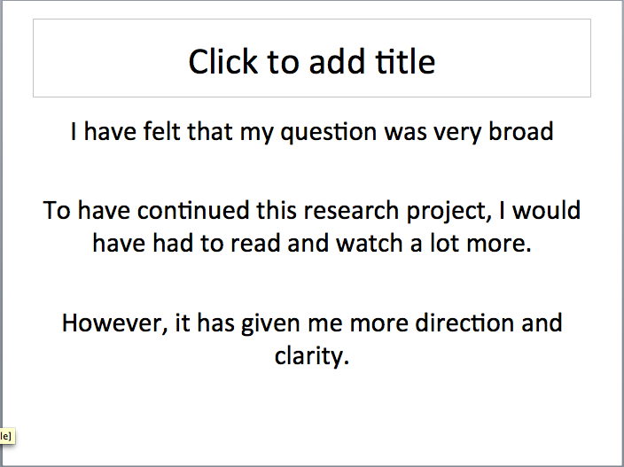
-       I feel that my question was very broad and required more research which means longer than 1500 words.
-       To have continued this research project, I would have to read and watch a lot more. I feel that within 1500 words, the quality was adequate although I haven’t formed an actual answer, only more questions but more direction.

Click

-       As a design practitioner myself, the biggest influences that have changed the way I feel about originality was the thoughts and opinion of Paul Rand.
-       The quote ‘Do not try to be original, just try to be good’ has made me feel that originality has become less important in our modern day. It is more important to be simple, clear and to communicate your ideas effectively whether it is original or not.

Click

-       To have improved my efforts in this module, I would have liked to have read more and to have put in a lot more time. This would be my advise to anyone under taking something similar in the future.


Slides


Overall, I think my presentation went really well. I was very nervous about it as I wasn't very confident about the essay itself but it worked out well. I received some positive feedback that I was happy with and some feedback for next time.
I know exactly what to do next time, which is more reading, more note taking, spreading it out over a longer time to give myself some time to think about the subject and to write up more draft versions.

Note. Learn the proper Harvard reference system.


Friday, 23 March 2012

Bibliography


Below is the bibliography to my essay so far. It consists of many different source methods.

Bibliography

Author
Title
Date published
Place of publish
Name of publisher
Oxford Uni
The dictionary
2006
New York, US
Oxford University Press Inc.
Wikipedia
‘Constructivism’


Michael Drolet
The Postmodernism Reader
2004
New Fetter lane, London
Routledge
John Docker
Postmodernism and Popular culture
1994
Cambridge
C.U.P

The Art Book
1997
New York
Phaidon press inc.
Fabiola Reyes
Typo

Barcelona
Monsa
David Hare
The Myth of Originality in Contemporary Art


Jstor.org
Pajda Perina
Originality in contemporary design
2006

Pernia.net

Tuesday, 13 March 2012

Draft 1 - Can new Design be original?


My essay draft 1. 
The question remains as shown below.

Can new Design be original?

Firstly, I chose this subject area and question based on the fact that I am deeply interested in design in all areas across the board mainly focusing on Graphic design, and that I have questioned and debated originality for many years, which is partly why I got into design in the first place. Concluding this question or growing an understanding of it by researching into theories from all ages and movements, will increase my knowledge and hopefully make me an even more creative and open minded designer.

I am going to research contextual and relevant information to try and answer this question, or at least grasp a stronger understanding. Looking into the meaning of the verbs in the question itself will be my starting point, focussing only or mostly on ‘Originality’. To continue answering the question and focus on the main part of it, I am going to look into the roots of originality in design; when people starting looking for it, why it is more important than repetition (if it is/the arguments over the case) and compare it to the way it fits in with other professions and everyday life. I am going to write it in such a way that I can share my views and opinions whist analysing the arguments at hand.

            What is originality? Can it be defined so simply? There are many arguments as to whether you can define something original or not. There are also different types of originality within different subject areas and in different context. The meaning to a general audience about whether an idea is original or not could be hugely different from how a professional or someone in the specialist area would view it. Referring to the Oxford English Dictionary, the word ‘original’ literally means: existing from the beginning; first or earliest; the earliest form of something, from which copies can be made. 2. Created personally by a particular artist or writer, etc.; not a copy. 3. Inventive or novel. Etc. Noun – originality. ‘What is newly original in an artists work is never noticed by the public. It is frequently unnoticed by himself’. This sentence was taken from an article written by David Hare, ‘The myth of originality in contemporary art’. He uses the word ‘original’ as the meaning – creation, invention or different as opposed to the first or earliest of something at this point. This differs from many other ways in which the word is used. Hare writes as if neither the artist him/herself nor the public recognise originality straight away. ‘When originality is noticed and approved, it is on its way to becoming unoriginal’ Hare continues. It would have to be analysed and researched into before clarification he seems to mean, then something becomes unoriginal. When did it become original? The artist him/herself may assume an idea was their own, but it is hard to assign such a huge status to yourself without knowing the world and thoughts of others.

            How far back can originality go? Is there a start of something truly new and original ever, or does everything relate to something else in some way or another? I could ask these questions all day long, and pin pointing something like that would be impossible, or is it? These are questions that made me read into just the meaning of originality even more than needed. I was so interested in what people were saying about it in general.
           
            ‘A work remains permanently original if the artist refrains from dragging it through the mud of too much repetition’. David Hare, The Myth of Originality in Contemporary Art, jstor.org. This quote could be seen and interpreted in many different ways. It seems as if he uses the word ‘original’ in the meaning of the first of something or the earliest of something, of which copies can be made. It is also written as if something can be permanently original but whether the artist could help it or not, someone will repeat it, or repeat the idea and even then, producing one of something is still likely to be repeating something from history.

            Moving away from the topic of the meaning of originality, whilst researching and reading into related subjects, I became very interested in Protest Art and Propaganda. I was looking for something to write about and focus on to narrow the question down to something specific to then broaden back out towards the conclusion. This will hopefully help me understand specific areas better, which will then help me argue other points. I have and will continue to research this topic but to truly understand and appreciate the originality within design, I must look all the way back to the development of propaganda, the ideas used in the art, and where it all began.

Understanding and appreciating professional designers views will change the angle of research here and may be more interesting as we may be able to relate to a more informal comment/statement. Paul Rand, being one of the most respected Graphic Designers of our time, shares his thoughts in an interview from a short documentary. Paul Rand, Mead Generations, 1994. He expresses his feeling on originality as if it doesn’t matter within design anymore or even that it never did. ‘Do not try to be original, just try to be good’ quotes Rand.

The research I have made in all the ranges of sources and methods has very much helped me develop a strong opinion whilst understanding arguments against this. Although I could have written more and researched more, which is actually never ending, I feel that design can be still be fully original but this may not necessarily make something eye-catching or suitable for the purpose. I believe it has to be controlled, if it is even uncontrollable. Everyone can be original as I believe, but it doesn’t just happen for some people.

I strongly believe and follow Rand’s statement/beliefs because not only is it logical but when analysing works of others, we do not look for originality or at least not straight away.  We look at something and decide whether it looks good, why it looks good or what it means.
When I think of some of my favourite design, I remember it because it is good, not if it is original. If I sat there and criticised a piece of work, I would be able to most likely pick it apart and state why this wasn’t original nor that. In some ways of analysing my opinion, we could say that the research I have taken has lead me to disregard the original question completely now, which does not disappoint me at all. However, I do still feel that originality in design can be important and does need to remain for the future. If we were indeed without originality from now until forever, we would end up recycling old design and making it the new. I have struggled to find any evidence or information on this particular subject. I am sure someone has written about the cycle of graphic design styles but it is very difficult to find as I have found. This will have to be a continued research project that I will take forward on my own separately.

            This question has proven great importance to me and will to many others. It has separated vague areas of which I have learned in the past and has introduced me to whole new ways of thinking about originality. A successful designer should know and understand the history of originality, why it is important if at all and modern and professional views too. This is why I believe this question is a very interesting and useful subject to understand yet can be so open to opinion and interpretation.

            When narrowing the question of originality down to specific subject areas, it also helped gain a greater understanding because it allows us to target and study the question in different context. The history of that specific area may change ones whole perspective and redirect toward the opposite end of the spectrum as it is such a hard question to answer with a yes or no. Design can be original, is that the importance anymore?
     

Sunday, 11 March 2012

Research

Amongst my research for my essay, I came across a really interesting quote that I wanted to share. 

This opened my opinion up to the views of originality. I used this quote to look further into and found some interesting information that I am likely to include in my essay. Although it is a quote to think about to fully understand, it becomes simple once read over. And just in that short line, opens up endless debatable questions and theories.

Thursday, 8 March 2012

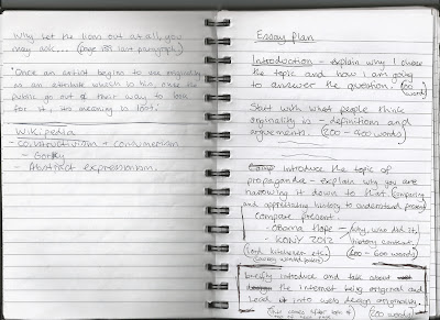
Notes for essay

Below are some of my notes made before and whilst writing my essay. The question has not been fully decided but is based on how design can or cannot be original.


Monday, 27 February 2012

Structure to final project, Level 1


CHI – Level 1 research project

STRUCTURE

Title

Introduction – Why this subject?

Context for your discussion – why is this relevant now?

Debate:
1. Whose writing, thinking, work are you going to use (to reference) in your work?
Refer to the module brief reading lists for useful resources, along with the reading that has
been posted on Blackboard. Also use the library (books & journal articles) to ensure that you
are aware of what others have written about your subject, as well as using the internet as a
resource. Remember – your bibliography & argument must demonstrate that you have used
broad-ranging sources, not solely relied on only one of these forms of information.

2. For/against – what is the discussion (argument) that you are going to discuss?

3. Develop your argument in relation to this, using examples to illustrate that you have informed
yourself about other people’s views (referencing your work).

Your opinions now that you have done this research – what are your views/ideas about this?
Is there a clear answer? Is it a difficult subject to make a clear conclusion from? If so, why?

Conclusion

DRAFT deadline: 14th March 2012

Thursday, 5 January 2012

Initial ideas and interests


Creative Histories and Industries – for after the Xmas Break


Research Project – Initial ideas and interests


Try to be analytical & critical, rather than just descriptive in your answers to these questions. Consider WHY?  you are interested in the specific areas that you are – this will help to clarify areas that you might want to go on and research further.

You may have lots of ideas – that’s great! Note them all & we can discuss these at the start of next term before you decide which you want to focus on for the next stage of the module.

Do you already have some ideas about what you would like to research?
If so, make some notes about these before moving on to the specific prompts below…… (which might also prompt some other ideas)…….


  1. Which areas of Creative Practices particularly interest you (these may include areas outside of your immediate subject specialism)?

Graphic Design, creativity, Originality, design in general, new art, old art


  1. Are there any questions that you have identified in your responses to the readings and lectures that have formed part of the module to date? What about any questions that you have posted on your blog?

What is creativity? What is Originality? What is design?


  1. Which aspects of the readings and lectures from the module have you agreed with?

Ethical theories, semiotic approaches and analysis, modernism, post-modernism,


  1. Which aspects of the reading and lectures from the module have you found to be particularly interesting?

All of the lectures have been very interesting, educational and understandable in their on way. Favourite was ethical issues.


  1. Which aspects of the reading or the lectures and discussions from the module to date have you disagreed with?

I disagree with the use of animal skins and furs throughout fashion, the use of fake imagery in Graphic design.


  1. Are there any specific issues that you feel strongly about? (Art, Design & Media related or not?)


  1. Which exhibitions/events/screenings have you been to see since beginning the programme? Are there any specific aspects of these that have particularly interested you?

I have been to the exhibitions through the organised trips on the course which have all be influential and educational in their own way. I am planning to go to some through the summer as well. 


  1. What do you know about contemporary employment practices in your chosen area of specialism?


  1. Are you specifically interested in any aspect of commercial practices?

I am very interested in the advertisement aspects of graphic design, the different approaches, techniques etc. I am also interested in the sports fashion of the world, particularly in snowboarding. I would very much like to get involved and learn more about this practice. I would like to be involved in the morally correct and ethically correct fashion design.


  1. What do you intend to do at the end of the Foundation Degree? Do you know how you are going to go about this? What do you need to know to pursue your ambitions?

I intend to move onto and complete the ‘top up’ year 3 on the bower ashton course of graphic design. I would then like to either complete a masters or get involved in snowboard graphic design. This is in an ideal world and what my aim is for the future. I intend to get some work experience within design businesses before I move off on my own.

Thursday, 1 December 2011

Analysing visual material

Gillian Rose's method for analysing visual material 


I am going to find a advertisement, either poster, TV ad or magazine ad and analyse it using the methods of Gillian Rose.


Wednesday, 16 November 2011

Semiotics

Image as Language
Semiotics: the 'science of sign systems'
Session 6

What does this mean?
Semiotics is the study of signs. This can range from just a simple toilet door sign with a male or female imposed all the way through to the media superimposing something to make it seem socially correct.
In simple terms, in language, the term 'shut it' can mean stop making noise or could mean close something. This is seen as being implied rather than literally. As a whole, it is all based on communicational behaviour. This can be through language, gestures or even fashion/clothing.

As a task, I am going to break down a music video and analyse it for its semiotics.

Pink - Stupid Girls


The video starts with a young girl watching TV. She is watching a programme on how to be proper/etiquette. An angel and devil appear on both shoulders, the angel being a normal, non-mainstream girls and the angel being plastic, perfect doll looking.

2nd scene - GIrl walking into clothing shop all dressed up, wearing sunglasses at night time. Is indicating that wearing sunglasses is to look more attractive but she stupidly walks into the glass door/window. 

3rd scene - Female president - showing that it is possible if you have ambition. 'Girls with ambition, thats what I want to see' (lyric)

4th scene - music video of a girl dancing on 50 Cent, trying to look sexy. This is indicating that dancing raunchy is attractive.

5th scene - Girl buys a small cute looking dog - trying to fit in with the whole Beverly Hills/Hollywood look. 

6th scene - Fake tan. being darker with bleach blonde hair is supposed to be more attractive. people around her don't think so.

7th scene - bowling alley - girl catches her boyfriend/date looking at another girl with revealing clothes, big breasts, skinny, long legs, make up etc. as opposed to 'pink' who is dressed with clothes covering herself. She then uses a secret button to expand her breasts to look more 'attractive'.

8th scene - Getting plastic surgery. Dooted lines marking out where the surgery will occur. This is in areas such as cheeks, breasts, stomach and a 'reconstruction' label on the front of her underwear.

9th scene - Goes back to Pink trying to express to girls that you don't need to fit in, you should do what you want as shes playing football with some guys. repeats the lyric 'Girls with ambition, thats what I want to see' 

10th scene - Girl runs down/drives into another woman but cares more about her make up, being on the phone and looking good in her convertible.

11th scene - She tries to get attention from a guy in the gym but doesn't get it. The guy goes to another girl that is dressed sexier (small top and pants). Pink then takes her top off, down to a small top to try and look  more attractive.

12th scene - In night club toilets, trying to throw up after eating/drinking too much. She then shouts 'I want to be skinny'. This is showing that some people go through bulimia to try and be skinny. And shows that being skinny is more attractive. This however should not be the case in reality as it can cause many physiological and physical problems for life.

13th scene - Sex video - making it seem like making a sex video is attractive. Mocking Paris Hiltons sex scandal. 

14th scene - Washing car in bare minimum clothes, bleach blonde hair, water everywhere etc. Like the Jessica Simpson video.

15th scene - Old woman or Young woman with wrinkles trying to look attractive/sexy by wearing all pink, with a pink car, bleach blonde hair, skinny etc. Closes up on her and shows you that she is unattractive and this is what could happen from too much plastic surgery and fake tan.

The music video ends back in the living room with the young girl watching TV. The angels are begging her to take their side. She looks down at a barbie doll (the mainstream) and an american football (different and natural exercise). The girl then takes the angels side and plays football.  

My analysis
Most of the scenes in this video are trying to show how the media have made the skinny, blonde, big breasted, long legged, plastic girls into the ambition for every girl. Pink expresses that she thinks its 'stupid' and doesn't want to be a part of it. On her part, it is a very good ethical message to try and pass on. Some of the lyrics read that girls should have great ambition in life to do something great such as becoming president or being in sports. these are both highly respected roles that should be something people to aspire to be instead of a perfect little tart that just needs to look attractive, which has in-fact become the non-attractive in my opinion.


Fashion

What is Fashion?
Session 5 

In this Lecture, we discussed the background of fashion, what it means as an art and how it varies.

It can be viewed in many different ways all over the world. Fashion changes completely from culture to culture. Some countries, or even continents do not even consider fashion because of religion or just simply unfeasibility. It also show status. Being wealthy or well off can show massively through what you wear. This isn't a generalisation but a lot of wealthy people will wear designer clothing or smart clothing such as suits. 

Music is a big influence over fashion as well. This is usually more to do with fashion within youth or high street fashion. By looking at someone wears, you can sometimes tell what music they enjoy and even where the music is from. People that listen to heavy metal music quite often have either really long and unlooked after hair or completely shaven head. Tattoos come into play quite a lot with the fashion within music too. Wearing really dark and baggy clothes as opposed to sporty clothing makes it easy to tell whether the person listens to say goth music or hip hop and rap. (as mentioned above, this does not apply to all and cannot be seen as a generalisation). 

Fashion as an Art can be completely different and diverse. The clothing/garments designed may not be created for everyday wearability. Some items are purely to how off a certain skill with the creation or to express an emotion through colour and style. It can only be appreciated if the audience can understand it or make something of it if its abstract. This is usually presented through a Catwalk show.
Examples of this are below.


Very much like logos, fashion can communicate a message, idea or a meaning about something or someone. It can be explicit or implicit the same as logos too. 

The History

When fashion became an art or a profession, Charles Frederick Worth (1826-1895) was named the first fashion designer. Before fashion designers derived, clothing would have been sewn and produced by seamstresses and drapers. After Worth changed his role in the world (draper), he opened the first fashion house in what was the fashion capital of the world, Paris, also known as 'maison de couture'. He was also the first person to label his Art ion the fashion industry and was seen to be the relief of corsets for women.
Here are some examples of his work.


As a recap and a bullet point list of what fashion is and can be interpreted as
  • Art
  • Personality 
  • Expressive
  • Structured
  • Identity
  • Attractiveness
  • changes through time
  • Cultural and religious
  • Diverse
  • Status
  • Based on Music


Tuesday, 15 November 2011

What is good Graphic Design?

London 2012 Olympics Logo
Session 4 task


This logo was designed by Graphic Designer Wolff Olins back in 2007. It was launched to the public in London on 4 June 2007 by Sebastian Coe and a team of London 2012 ambassadors. 
It has been largely criticised and generated a lot of disturbances around the world. Not only did 80% of the public vote for the worse end of the poll calling it the worst logo ever, but the country of Iran threatened to boycott the games due to it spelling the word 'Zion', which is a biblical term, often refers to the city Jerusalem. 

The logo itself, is based on '2012' and incorporates the world-wide recognised olympic rings. It includes the word London as well to state the location. London is actually the first City to host the games alone. The font itself was created for the event and is named after it as well. 
The symbols used for the Olympics and Paralympics are based on the same core shape. This was to help represent the commitment of london fully integrating the two events.

The Emblem serves as a window to present relevant content such as photography, illustration or art. This has enabled commercial sponsors to demonstrate a real partnership by changing the colour or the inside of the Emblem to fit with their corporate colours or specific campaign.

The four original colours of the London 2012 identity – pink, blue, green and orange – were inspired by the worlds of media, communications and fashion. The colours were carefully chosen to communicate the spirit of the London 2012 Games: energetic, spirited, bright and youthful.

From the comment above, I really agree with these strengths that the symbol has. The communication of the colour choice is clever, also unlike a lot of Logos, this has massive opportunity for change of colour to fit in with another brand which brings in more advertisement for the event and charities. Below are a group of examples.


 Here, Adidas have simply made it black and white to fit with their logo, which i think works very well. 


Personally, my favourite of the brand personalised editions of the logo is the BP version. The chosen colours relate to the BP logo/theme and they stand out well. As we all know the colours of BP, the olympic logo could stand on its own and potentially still be read as BP.


Other criticisms 

"The London 2012 logo has been presented with promising descriptive text but besides the date, I don't think the logo itself attempts to reference anything of significance," he says. "It has certainly aroused a lot of critical references, from grade school paper cuts to porno"  - Lance Wyman

I feel that the comment above has strong views, which unfortunately make perfect sense against the logo. I also feel that the 'paper cuts' could be seen as a good way to get the youth to feel involved. Children may see the logo as a young playful symbol to admire. This reason does make the event feel youthful, which cant be a bad thing in any case. 

Being a Graphic Design student, there are many aspects of the logo that I could criticise from how I have been taught however, I think as the logo stands for something aimed at probably the biggest audience in world, it would be difficult for the designer (Olins) to suit everyone. The positive outcomes that I have spoken of are very well thought of work very well for the event. This is my view and the way I would like to see it since reading the many articles and comments on the subject.