Semiotics is the study of signs. This can range from just a simple toilet door sign with a male or female imposed all the way through to the media superimposing something to make it seem socially correct.
In simple terms, in language, the term 'shut it' can mean stop making noise or could mean close something. This is seen as being implied rather than literally. As a whole, it is all based on communicational behaviour. This can be through language, gestures or even fashion/clothing.
As a task, I am going to break down a music video and analyse it for its semiotics.
Pink - Stupid Girls
The video starts with a young girl watching TV. She is watching a programme on how to be proper/etiquette. An angel and devil appear on both shoulders, the angel being a normal, non-mainstream girls and the angel being plastic, perfect doll looking.
2nd scene - GIrl walking into clothing shop all dressed up, wearing sunglasses at night time. Is indicating that wearing sunglasses is to look more attractive but she stupidly walks into the glass door/window.
3rd scene - Female president - showing that it is possible if you have ambition. 'Girls with ambition, thats what I want to see' (lyric)
4th scene - music video of a girl dancing on 50 Cent, trying to look sexy. This is indicating that dancing raunchy is attractive.
5th scene - Girl buys a small cute looking dog - trying to fit in with the whole Beverly Hills/Hollywood look.
6th scene - Fake tan. being darker with bleach blonde hair is supposed to be more attractive. people around her don't think so.
7th scene - bowling alley - girl catches her boyfriend/date looking at another girl with revealing clothes, big breasts, skinny, long legs, make up etc. as opposed to 'pink' who is dressed with clothes covering herself. She then uses a secret button to expand her breasts to look more 'attractive'.
8th scene - Getting plastic surgery. Dooted lines marking out where the surgery will occur. This is in areas such as cheeks, breasts, stomach and a 'reconstruction' label on the front of her underwear.
9th scene - Goes back to Pink trying to express to girls that you don't need to fit in, you should do what you want as shes playing football with some guys. repeats the lyric 'Girls with ambition, thats what I want to see'
10th scene - Girl runs down/drives into another woman but cares more about her make up, being on the phone and looking good in her convertible.
11th scene - She tries to get attention from a guy in the gym but doesn't get it. The guy goes to another girl that is dressed sexier (small top and pants). Pink then takes her top off, down to a small top to try and look more attractive.
12th scene - In night club toilets, trying to throw up after eating/drinking too much. She then shouts 'I want to be skinny'. This is showing that some people go through bulimia to try and be skinny. And shows that being skinny is more attractive. This however should not be the case in reality as it can cause many physiological and physical problems for life.
13th scene - Sex video - making it seem like making a sex video is attractive. Mocking Paris Hiltons sex scandal.
14th scene - Washing car in bare minimum clothes, bleach blonde hair, water everywhere etc. Like the Jessica Simpson video.
15th scene - Old woman or Young woman with wrinkles trying to look attractive/sexy by wearing all pink, with a pink car, bleach blonde hair, skinny etc. Closes up on her and shows you that she is unattractive and this is what could happen from too much plastic surgery and fake tan.
The music video ends back in the living room with the young girl watching TV. The angels are begging her to take their side. She looks down at a barbie doll (the mainstream) and an american football (different and natural exercise). The girl then takes the angels side and plays football.
My analysis
Most of the scenes in this video are trying to show how the media have made the skinny, blonde, big breasted, long legged, plastic girls into the ambition for every girl. Pink expresses that she thinks its 'stupid' and doesn't want to be a part of it. On her part, it is a very good ethical message to try and pass on. Some of the lyrics read that girls should have great ambition in life to do something great such as becoming president or being in sports. these are both highly respected roles that should be something people to aspire to be instead of a perfect little tart that just needs to look attractive, which has in-fact become the non-attractive in my opinion.
In this Lecture, we discussed the background of fashion, what it means as an art and how it varies.
It can be viewed in many different ways all over the world. Fashion changes completely from culture to culture. Some countries, or even continents do not even consider fashion because of religion or just simply unfeasibility. It also show status. Being wealthy or well off can show massively through what you wear. This isn't a generalisation but a lot of wealthy people will wear designer clothing or smart clothing such as suits.
Music is a big influence over fashion as well. This is usually more to do with fashion within youth or high street fashion. By looking at someone wears, you can sometimes tell what music they enjoy and even where the music is from. People that listen to heavy metal music quite often have either really long and unlooked after hair or completely shaven head. Tattoos come into play quite a lot with the fashion within music too. Wearing really dark and baggy clothes as opposed to sporty clothing makes it easy to tell whether the person listens to say goth music or hip hop and rap. (as mentioned above, this does not apply to all and cannot be seen as a generalisation).
Fashion as an Art can be completely different and diverse. The clothing/garments designed may not be created for everyday wearability. Some items are purely to how off a certain skill with the creation or to express an emotion through colour and style. It can only be appreciated if the audience can understand it or make something of it if its abstract. This is usually presented through a Catwalk show.
Examples of this are below.
Very much like logos, fashion can communicate a message, idea or a meaning about something or someone. It can be explicit or implicit the same as logos too.
The History
When fashion became an art or a profession, Charles Frederick Worth (1826-1895) was named the first fashion designer. Before fashion designers derived, clothing would have been sewn and produced by seamstresses and drapers. After Worth changed his role in the world (draper), he opened the first fashion house in what was the fashion capital of the world, Paris, also known as 'maison de couture'. He was also the first person to label his Art ion the fashion industry and was seen to be the relief of corsets for women.
Here are some examples of his work.
As a recap and a bullet point list of what fashion is and can be interpreted as
This logo was designed by Graphic Designer Wolff Olins back in 2007. It was launched to the public in London on 4 June 2007 by Sebastian Coe and a team of London 2012 ambassadors.
It has been largely criticised and generated a lot of disturbances around the world. Not only did 80% of the public vote for the worse end of the poll calling it the worst logo ever, but the country of Iran threatened to boycott the games due to it spelling the word 'Zion', which is a biblical term, often refers to the city Jerusalem.
The logo itself, is based on '2012' and incorporates the world-wide recognised olympic rings. It includes the word London as well to state the location. London is actually the first City to host the games alone. The font itself was created for the event and is named after it as well.
The symbols used for the Olympics and Paralympics are based on the same core shape. This was to help represent the commitment of london fully integrating the two events.
The Emblem serves as a window to present relevant content such as photography, illustration or art. This has enabled commercial sponsors to demonstrate a real partnership by changing the colour or the inside of the Emblem to fit with their corporate colours or specific campaign.
The four original colours of the London 2012 identity – pink, blue, green and orange – were inspired by the worlds of media, communications and fashion. The colours were carefully chosen to communicate the spirit of the London 2012 Games: energetic, spirited, bright and youthful.
From the comment above, I really agree with these strengths that the symbol has. The communication of the colour choice is clever, also unlike a lot of Logos, this has massive opportunity for change of colour to fit in with another brand which brings in more advertisement for the event and charities. Below are a group of examples.
Here, Adidas have simply made it black and white to fit with their logo, which i think works very well.
Personally, my favourite of the brand personalised editions of the logo is the BP version. The chosen colours relate to the BP logo/theme and they stand out well. As we all know the colours of BP, the olympic logo could stand on its own and potentially still be read as BP.
Other criticisms
"The London 2012 logo has been presented with promising descriptive text but besides the date, I don't think the logo itself attempts to reference anything of significance," he says. "It has certainly aroused a lot of critical references, from grade school paper cuts to porno" - Lance Wyman
I feel that the comment above has strong views, which unfortunately make perfect sense against the logo. I also feel that the 'paper cuts' could be seen as a good way to get the youth to feel involved. Children may see the logo as a young playful symbol to admire. This reason does make the event feel youthful, which cant be a bad thing in any case.
Being a Graphic Design student, there are many aspects of the logo that I could criticise from how I have been taught however, I think as the logo stands for something aimed at probably the biggest audience in world, it would be difficult for the designer (Olins) to suit everyone. The positive outcomes that I have spoken of are very well thought of work very well for the event. This is my view and the way I would like to see it since reading the many articles and comments on the subject.
It is a form of Art which was invented or started in the late 1920's or at least the form was named that around that time.
It is a way of communicating an idea through imagery, text, colour, layout and shapes. Generally it is aimed at an audience where as a lot of Art forms do not necessarily require that factor. In present day, Graphic designers are heavily involved in advertisement which is the most mainstream point of view over the subject. Many people do not like that factor because aiming something at an audience can take the true originality away from a piece of Art.
It is also the process of bringing a magazine or book together for sale or for publishing. This could be laying out the text and images that a journalist has put together all the way through to creating a visually interesting and eye catch book cover.
Logo's and brand images is also a very popular sector of Graphic Design.
Photography could be classed as a form too.
The simplest way of expressing the meaning - Graphic Design is a way of visually communicating a message to an audience. ( http://www.aiga.org/guide-whatisgraphicdesign/ )
Below are a handful of examples
This is an example of a poster (or series of) to advertise something. It includes Typography, colour arrangement, shapes, photography, layout and illustration.
Here is an example of typography at its best, book cover design, layout, shapes and colour.
The above 12 logo's are for some of the biggest and most recognisable brands in the world. A designer or group of designers would have drawn up many versions of these before finally deciding on one for publishing. They are all extremely successful and are very unique/original in their own way.
This form of design is a favourite of mine at the moment. It is creative, different every time and i believe has a great sense of achievement once finished.
History
As mentioned above, the term Graphic Design derived around the 1920's but the art form and its many sub-styles can date back as far as ancient times. From the Illuminated manuscripts to cave paintings, it could be seen in its many forms way before its title.
Symbols
A brilliant example of Graphic Design would be the use of symbols from all over the world. As a human race, we recognise shapes and objects together where as words/typography/text, we may not.
The Male and Female symbols which are mostly displayed on public toilets is a perfect example of the world wide readable design. Instead of the words MEN or WOMEN written on the entrance to a toilet or changing room, these symbols make it easy, cheap and more easy on the eye for everyone.
The first thing we discussed in the second lecture of the term was based on a question -
What ethical questions are raised in the creative industries?
The answers to this question are completely personal opinion, however the answers below do not necessarily relate to my opinion. They are notes from the group discussion.
Graphic design
-Promotion of anything bad for your health
-Airbrushing - unrealistic views of people
Photography
-airbrushing
-image consent form (under 16)
nude images being published e.g. Linsey Lohan photo that was released on the front of newspapers.
Fashion
- using animal fur or animal products
-the size and health of models.
The second half of this lecture was based on looking further into photography -
What is Photography?
Including the meanings I took away from the previous lecture, I found more meaning.
It is the Art or process of capturing photographic imagery.
Niecephore Niepce took the first ever photo in 1825.
In the 1800's, photos had no title, they were only used for either educational purposes or to keep record of something or someone.
Edward Muybridge was the first person to create movement with a series of photos.
"Photography is one of the new media forms that changes perception and changes the structure of society"
In the first lecture of the year and course in this subject area was based on a range of broad meanings for the Art forms; Graphic design, Photography and Fashion.
Before we looked into the meanings of these Art forms, we looked into the meaning of 'Visual culture'. From what I gathered in my notes was - 'Visual culture is being able to read and understand anything visual - imagery'. As my notes from that lecture didn't exactly make sense, I looked into the meaning a little further by researching the meaning on the internet.
Wikipedia - Visual Culture as an academic subject is a field of study that generally includes some combination of cultural studies, art history, critical theory, philosophy, and anthropology, by focusing on aspects of culture that rely on visual images.
The extra research I did was helpful as it gave me a stronger understanding. The simplest way of putting it - Visual culture is the study of images that impact society or society and culture impacting images.
Graphic Design - below are the notes I took from the lecture on the meaning.
A way of visually communicating an idea.
It is generally aimed at an audience to catch attention and convey an idea to them - Using Layout, colour, typeface, imagery, shapes etc. It can be produced in many ways such as digitally, 2D, 3D, print etc.
Examples of Graphic design -
Photography
Capturing a moment in time that conveys messages - meanings that people can interpret in their own way. (can be used in graphic design)
It also works well with other Art forms such as fashion. Taking photos of Models for instance, in interesting angles and editing the photos is a very popular and commercialised form of photography.
Can be used to tell a story - a single photo can give the idea of movement or a series of photos can give the idea of more than one movement.
Can be used to create emotion - the photo below shows a starving child somewhere in africa. The photo is extremely powerful and emotional. It makes you feel really sorry for that child and makes you want to do something about it. If you were actually there, walking past that same child, the emotion may not be there as much.
Fashion
The notes I took down from my peers views over meaning of fashion concluded - expressing individuality and personality through physical media - something we wear in this case.
There are also different levels of fashion. In present time, catwalk fashion designers generally design crazy and interesting garments where as 'Karen Millen' for instance, is a fashion designer that designed clothes for up market shops - to put it simply, just for people to wear because the garment looks nice and fits comfortably.
As mentioned before, fashion is seen in photography and even Graphic design. Some graphic designers have their own clothing label - the logo, t-shirt prints, styles etc.
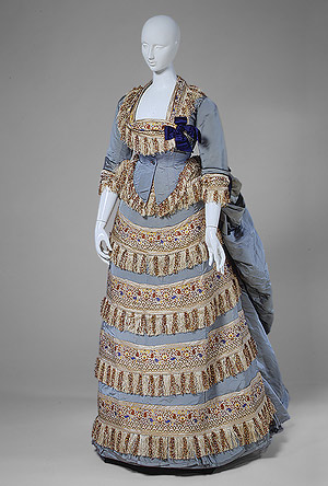
Below are some examples of Fashion. From extreme catwalk to street fashion.
Paul Rand (1914 - 1996) was an American Modernist/Graphic Designer who was extremely well known for his logo design. He has designed many Logos that you and I will seen throughout our lives. He is also famous for his Quotes that have vast meaning and inspiration to designers of all ages.
His most successful and most familiar logos are below.
International Business machines.
American Broadcasting company.
NeXT computers. (Steve Jobs)
United Parcel Service.
Ford motors.
From that collection of logos that Paul rand has designed, I'm sure you know every single one of them. Some of these logos may have been developed since Rand designed them but they still remain the original logos of these companies that stuck in heads from first sight.
Rand lived a very successful career and has many more pieces of Art including other forms of advertising, editorial design and even paintings which you can find on his website.
Design is the method of putting form and content together. Design, just as art, has multiple definitions; there is no single definition. Design can be art. Design can be aesthetics. Design is so simple, that's why it is so complicated.
Shepard Fairey has been a massive influence on my work in the sense of having a not-for-profit ethos. His commercialised street art has come along way and he is a well established street artist, musician, graphic designer and clothes designer.
I am a big fan of his work and I follow him and his company as he works all over the world and films his tours for artists like myself to watch and in his eyes, hopefully be inspired. My favourite quote of his that I take with me into any piece of art I work on is 'Question Everything'.
Here is an interview on Shepard Fairey and his growth throughout the years in street art and graphic design. (Biography)
Here is a collaboration of some of my favourite works of his.
OBEY Giant - this piece developed from an idea Fairey had when he was 14 years of age. It is based on a sticker he created for a joke with his friends which was portraying 'Andre the Giant' who was a Wrestler back when Fairey was in his teens.
This has now become a logo for Fairey's design company which has become massive in the last year or so.
A very well known piece of his is the Obama 'Hope' poster which supported Obama in his campaign to be elected the President of the US in 2008. Although Fairey was not approached to produce a poster for Obama's campaign, the image really helped him to be elected. Fairey was later thanked and commissioned to produce Thousands of copies by Obama himself in letter form which I'm sure Fairey was very pleased and proud of.


 Here, Adidas have simply made it black and white to fit with their logo, which i think works very well.


